Brand Design
Marcos Hardman, and independent consultant needed a strong brand identity so set him apart in a niche industry.
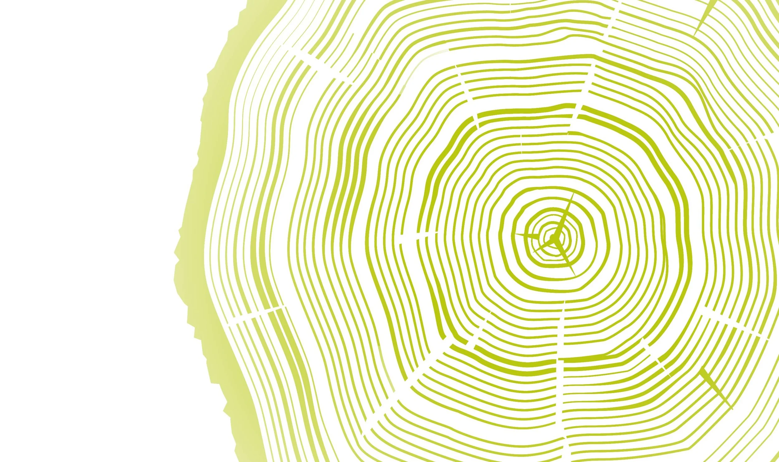
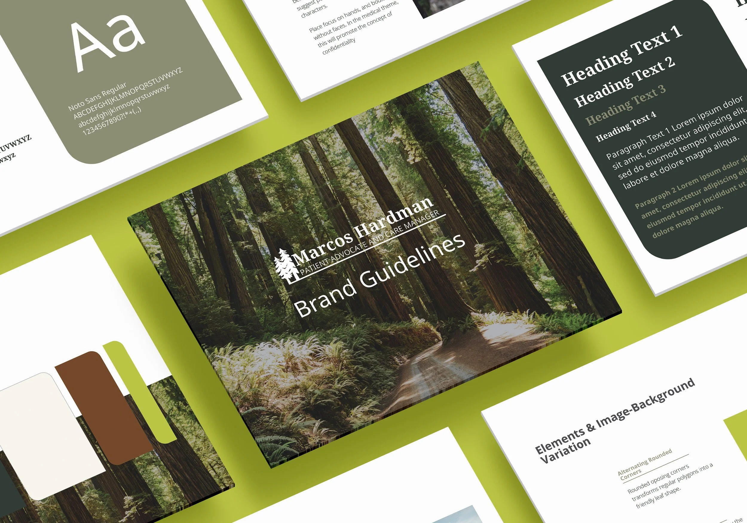
When discussing his logo and design elements, we chose to include imagery from redwood trees. Mr. Hardman operates out of Sonoma County and throughout the Bay Area. He resonates with the giant trees, their resilience, and healing energy.
The color palette, comprising muted greens and warm reds, instills feelings of healing and strength. A bright, lichen green was included as an accent color to add a modern twist that would complement the rest of the woodsy harmony. We developed a solid look that would command attention and solidify the core messaging on his website and materials.
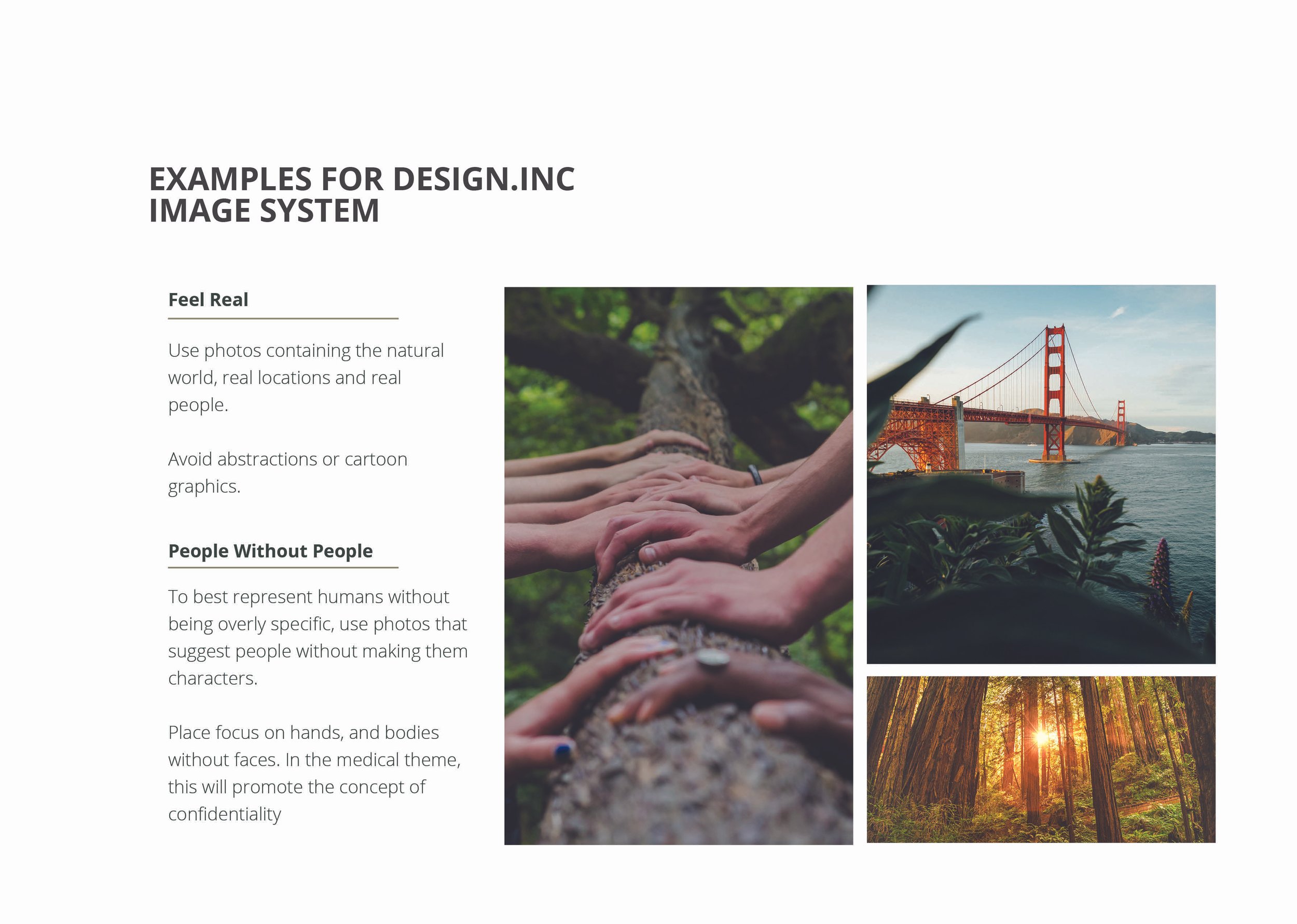
Photography guidelines included natural scenery from the Bay Area and imagery of people achieving their goals towards health and wellness.